Measuring Classifier Model Performance
Published: Aug 15, 2021
Last updated: Aug 15, 2021
This is Day 28 of the #100DaysOfPython challenge.
This post will take the work that was done yesterday in the blog post "First Look At Supervised Learning With Classification" and introduce the concept of training/test sets and output a graph for us to interpret the accuracy of the k-nearest neighbors classifier.
The final code can be found on my GitHub repo okeeffed/measuring-classifier-model-performance.
Prerequisites
- Familiarity Conda package, dependency and virtual environment manager. A handy additional reference for Conda is the blog post "The Definitive Guide to Conda Environments" on "Towards Data Science".
- Familiarity with JupyterLab. See here for my post on JupyterLab.
- These projects will also run Python notebooks on VSCode with the Jupyter Notebooks extension. If you do not use VSCode, it is expected that you know how to run notebooks (or alter the method for what works best for you).
- Read "First Look At Supervised Learning With Classification".
Getting started
Let's create the measuring-classifier-model-performance directory and install the required packages.
# Make the `measuring-classifier-model-performance` directory $ mkdir measuring-classifier-model-performance $ cd measuring-classifier-model-performance # Create a docs folder to place our notebook $ mkdir docs $ touch docs/measuring-classifier-model-performance.ipynb
At this stage, we will need to bring across our initial code from yesterday's post.
Bringing the code up to par
In our file docs/measuring-classifier-model-performance, we can add the following:
# Importing our required libraries from sklearn import datasets import pandas as pd import numpy as np import matplotlib.pyplot as plt plt.style.use('ggplot') # Exploring the Iris dataset iris = datasets.load_iris() type(iris) # sklearn.datasets.base.Bunch - a dictionary-like object with key-value pairs print(iris.keys()) # dict_keys(['data', 'target', 'target_names', 'DESCR', 'feature_names']) print(iris.feature_names) # ['sepal length (cm)', 'sepal width (cm)', 'petal length (cm)', 'petal width (cm)'] type(iris.data) # numpy.ndarray type(iris.target) # numpy.ndarray) iris.data.shape # (150, 4) - 150 rows and 4 columns iris.target_names # array(['setosa', 'versicolor', 'virginica'], dtype='<U10') these will be encoded as 0, 1, 2 # Setting our features to X and our target variables to y X = iris.data y = iris.target # Create the dataframe df = pd.DataFrame(X, columns=iris.feature_names) print(df.head()) # print the first 5 rows # Help visualize the data. # c stands for color so we display color by species. # figsize will be the size of the figure. # marker is the shape of the points. _ = pd.plotting.scatter_matrix(df, c = y, figsize = [8,8], s = 150, marker = 'D') # Diagonal line are histograms of the features corresponding the rows and columns. # The rest of the lines are scatter plots of the column feature vs the row feature color by target variable. # We can see that petalwidth and petallength are highly correlated. plt.show()
The above code was introduced previous. From here on out, we want to create a training and test set for our classifier.
Creating a training and test set
The "training" and "test" set are the data that we will use to train our classifier. We will use the "test" set to test the accuracy of our classifier.
We do this by splitting up the entire data set using the train_test_split function. In a new cell, add the following:
from sklearn.model_selection import train_test_split # Use the function to randomly split out data into a training set and a test set. # We can reproduce the split we did in the first example by setting the random_state keyword arg. # @see https://scikit-learn.org/stable/modules/generated/sklearn.model_selection.train_test_split.html X_train, X_test, y_train, y_test = train_test_split(X, y, test_size=0.3, random_state=21, stratify=y)
In the above code, we are doing the following:
- Splitting our data into a test size of 30% and a training size of 70% (as denoted in the kwarg
test_size). - Setting the
random_statekeyword arg to 21. This will ensure that the split is reproducible. - Setting the
stratifykeyword arg to theyvariable. This will ensure that the split is stratified. That is to say, that the ratio of the training set to the test set will be the same for each class.
The function itself returns four numpy.ndarray types in the order we assign X_train, X_test, y_train, y_test.
More information for train_test_split can be found here.
Checking a classifier for fit
In relation to the k-Nearest Neighbors classifier, we need to check how good the fit is for our model.
As the value k increases, the decision boundary becomes smoothers. This is known as "a less complex model".
Smaller k is more complex and can lead to overfitting. This can be defined as the production of an analysis that corresponds too closely or exactly to a particular set of data, and may therefore fail to fit additional data or predict future observations reliably.
If you increase k even more, you can end up underfitting. This is the opposite of overfitting and occurs when a statistical model cannot adequately capture the underlying structure of the data.
There is a sweet spot in the middle that we are aiming for that gives us the best fit.
We can manually inspect this by using the score method and iterating over different values of k.
To see this in action, we will add the following code a new cell in our Python notebook:
# Setup arrays to store train and test accuracies neighbors = np.arange(1, 9) train_accuracy = np.empty(len(neighbors)) test_accuracy = np.empty(len(neighbors)) # Loop over different values of k for i, k in enumerate(neighbors): # Setup a k-NN Classifier with k neighbors: knn knn = KNeighborsClassifier(n_neighbors = k) # Fit the classifier to the training data knn.fit(X_train, y_train) #Compute accuracy on the training set train_accuracy[i] = knn.score(X_train, y_train) #Compute accuracy on the testing set test_accuracy[i] = knn.score(X_test, y_test) # Generate plot plt.title('k-NN: Varying Number of Neighbors') plt.plot(neighbors, test_accuracy, label = 'Testing Accuracy') plt.plot(neighbors, train_accuracy, label = 'Training Accuracy') plt.legend() plt.xlabel('Number of Neighbors') plt.ylabel('Accuracy') plt.show()
The above iterates through possible k values 1 to 8 and plots the accuracy of both the testing and training data against a graph for us to interpret.
The output image looks like so:

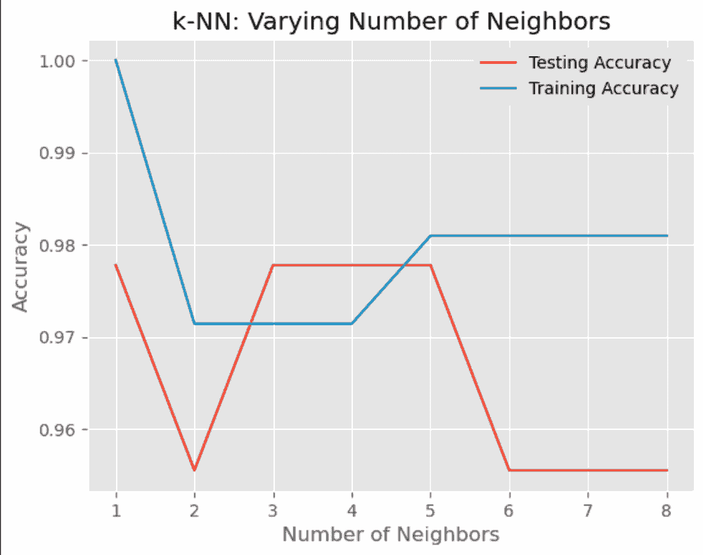
Comparing Testing vs Training accuracy
When looking at the graph, we can see that the accuracy of the test set decreases as we increase k after 5. This tells us that we may be experiencing underfitting.
As for k=1, we see the accuracy is quite high but this could strongly be a sign of overfitting.
As for the sweet spot, we see that k=3, k=4 and k=5 are the best values for our model, with k=5 looking like the most eligible fit.
Using our classifier with the determined parameter
The final step is to use our classifier with the determined parameter. In a new cell, we can add some unlabelled data and use our classifier to label it.
# A set of unlabeled data. X_new = np.array([[5.6, 2.8, 3.9, 1.1], [5.7, 2.6, 3.8, 1.3], [4.7, 3.2, 1.3, 0.2]]) # Showing the data frame df_new = pd.DataFrame(X_new, columns=iris.feature_names) print(df_new.head()) # print unlabeled data as a data frame # Setup a k-NN Classifier with k=5 (the determined parameter) knn = KNeighborsClassifier(n_neighbors = 5) # Fit the classifier to the training data knn.fit(X_train, y_train) prediction = knn.predict(X_new) X_new.shape # (1, 4) - 1 data point and 4 features (assuming in the example about you just used the first example and not more) print(prediction) # array([0]) - 0 is the label for the first example which will map to one of the iris labels # The prediction is [1 1 0] which maps to [versicolor versicolor setosa]
Summary
Today's post demonstrated how to produce a graph to help us search for parameters that produce a good fit for our k-Nearest Neighbors classifier.
We explored how to split our dataset into a training and test set, then produced a graph for us to look at to determine the best value of k for our classifier.
Resources and further reading
Photo credit: kelvinhan


Dennis O'Keeffe
Melbourne, Australia
1,200+ PEOPLE ALREADY JOINED ❤️️
Get fresh posts + news direct to your inbox.
No spam. We only send you relevant content.
Measuring Classifier Model Performance
Introduction
